Entering the Upside Down: What “Stranger Things” Teaches Us About Branding
How one show turned nostalgia, typography, and world‑building into a masterclass in brand — and how StoryPress lets us bring that energy into a single post. Tonight, as Stranger Things returns for its fifth and final season, it’s not just Netflix lighting up.
For us at StoryPress — founded by kids who actually grew up in the glow of CRT screens, BMX bikes, and wood‑paneled basements — this show hits a very specific nerve. It’s the rare series that doesn’t just use the 1980s as wallpaper; it rebuilds the decade as a whole experience: sound, color, texture, type.
This post is our small tribute to that.
You’re reading it inside a Stranger Things–inspired StoryPress theme: dark, almost‑black background, glowing red headings, warm off‑white text, and typography that nods to the show’s iconic ITC Benguiat logo without outright copying it. The rest of the StoryPress site can stay clean and modern — but here, at the post level, we’ve dipped the page into the Upside Down.
No code walkthroughs, no config screenshots. Just branding, storytelling, and what this show can teach anyone building a visual identity.
Stranger Things in 60 Seconds
On paper, Stranger Things is simple:
1980s small town. Missing kid. Kids on bikes. A secretive government lab. A girl with powers. A monster.
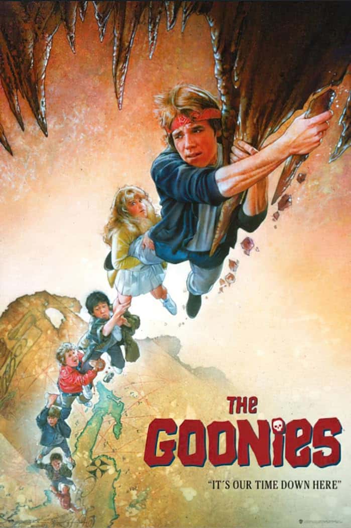
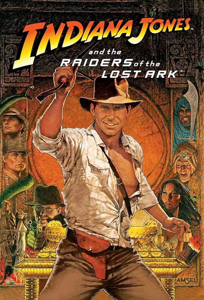
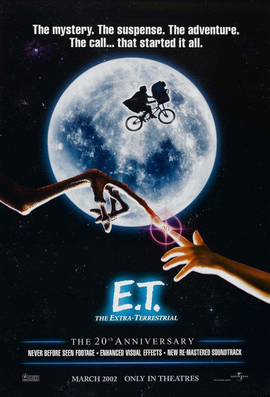
Created by Matt and Ross Duffer and released in 2016, the series starts as a love letter to Spielberg, Stephen King, and Amblin‑era adventure — then slowly turns into a sprawling saga about friendship, trauma, growing up, and parallel worlds.
What makes it powerful as a brand is the way every choice lines up:
The setting (1980s Hawkins, Indiana) isn’t just a backdrop; it’s a design system.
The music (synth scores, era‑defining tracks) acts like a sonic logo.
The cast bridges generations — from Winona Ryder to a new wave of breakout stars — anchoring the nostalgia while keeping it fresh.
The visual language — that red wordmark assembling out of the darkness — does a shocking amount of heavy lifting before a single line of dialogue.
Stranger Things isn’t just a TV show. It’s a coherent, multi‑channel brand that happens to be delivered as television.
The Logo That Opens a Portal
If you close your eyes and picture Stranger Things, chances are you don’t see a specific scene.
You see the logo.
Red, glowing letters slowly sliding into place over black. Hollow, serif forms with sharp terminals. The wordmark feels like a stack of worn Stephen King paperbacks and VHS horror sleeves brought to life.
That isn’t an accident:
The typeface is ITC Benguiat, a 1970s serif that became famous on 1980s book covers, album art, and genre posters.
The title sequence leans on long, patient motion: letters drifting in, assembling with unsettling calm.
The color is a very specific, almost‑neon red — intense enough to feel supernatural but still grounded in print and film poster history.
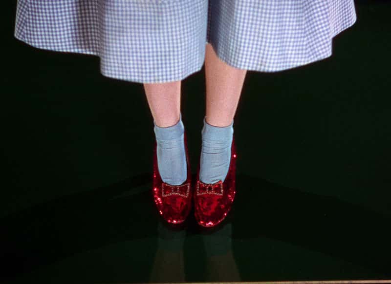
Dorothy’s Ruby Slippers in The Wizard of Oz | MGM 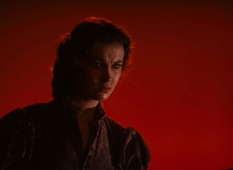
Scarlett O’Hara before a red background in Gone With The Wind | MGM 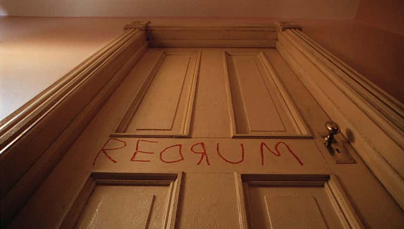
Redrum scrawled on the door in The Shining | Warner Bros. 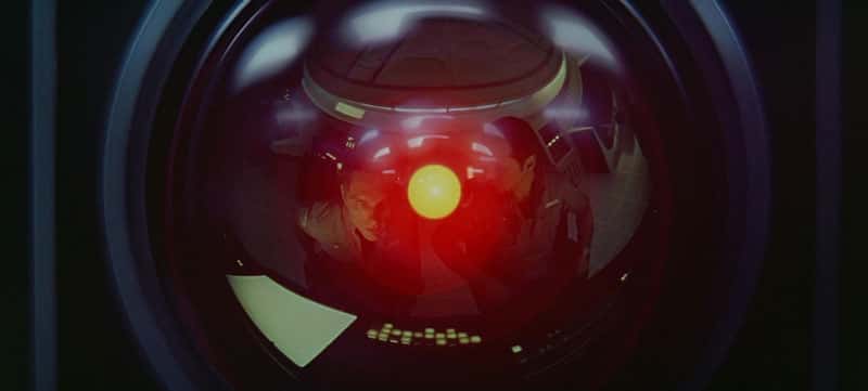
HAL 9000 in 2001: A Space Odyssey | MGM
It’s minimal. No Demogorgon silhouettes. No kids. No bikes. Just typography, motion, and music.
From a branding perspective, it’s a perfect reminder:
You don’t always need a mascot or a hyper‑detailed mark. With the right type, color, and pacing, a word can be a logo.
On this StoryPress post, we echo that logic — not by copying the font, but by mirroring the moves:
A dark, nearly black background to give the letters somewhere to glow.
High‑contrast red for headings so titles feel like mini wordmarks.
A serif display face for H1–H2 that leans dramatic and cinematic.
A clean sans‑serif body font so the long‑form reading experience stays modern and comfortable.
Global theme stays sensible. This page overrides just enough tokens — colors and typography — to feel like you stepped into Hawkins for a few minutes.
Nostalgia as a Design System
Stranger Things is often described as “nostalgic,” but that can sound like a fuzzy mood. In practice, the nostalgia is shockingly systematic.
Look at how consistent it is:
Spaces – wood‑paneled living rooms, cluttered basements, fluorescent school halls, the mall in Season 3 — each location has a specific palette and texture.
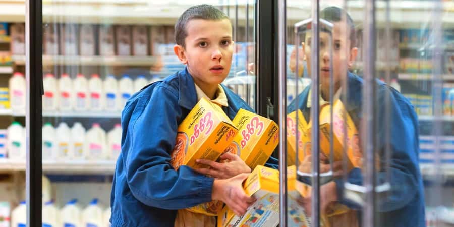
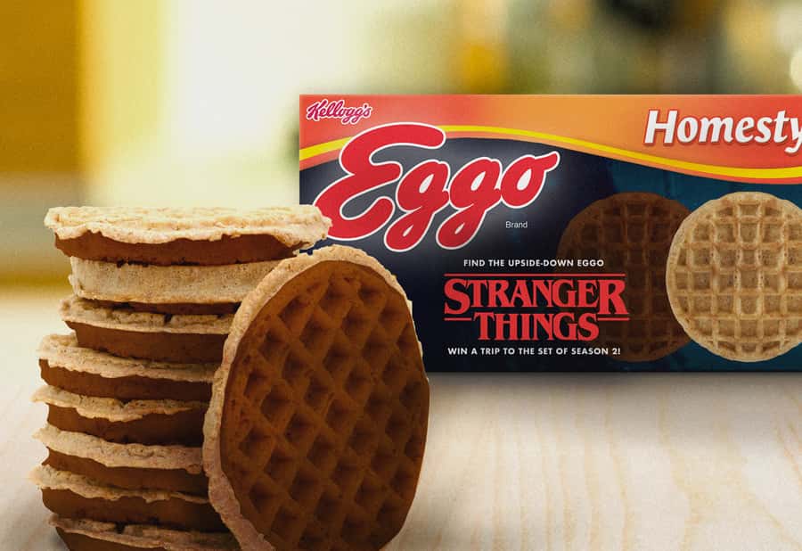
Objects – walkie‑talkies, Dungeons & Dragons manuals, Eggo waffles, cassette tapes, CRT monitors — they’re brand assets as much as props.
Fashion – denim, neon prints, puffer vests, Hawkins Hellfire Club tees — things real brands now sell again because of the show.
Lighting & color – deep blues and blacks for horror, sodium‑orange street lights for small‑town nights, sickly greens for labs.
All of that becomes a visual language that viewers can recognize even out of context. A screenshot with no logo, no characters, and most fans could still tell you, "That’s Stranger Things."
For anyone working on a brand, the lesson is clear:
Make choices that are consistent enough to be recognizable even when your name and logo are offscreen.
That’s what we tried to mirror here using StoryPress:
A global site theme covers your normal content with sane defaults.
This one post flips to a Hawkins‑at‑midnight palette and punchier type.
A collection page (say, all posts about branding or pop culture) could have its own variant — lighter background, same Stranger Things‑inspired accent colors.
Same CMS. Same content model. Multiple tonal “universes” depending on what story you’re telling.
From Show to Ecosystem: The Brand Beyond the Screen
Stranger Things started as a series and became a small universe of its own:
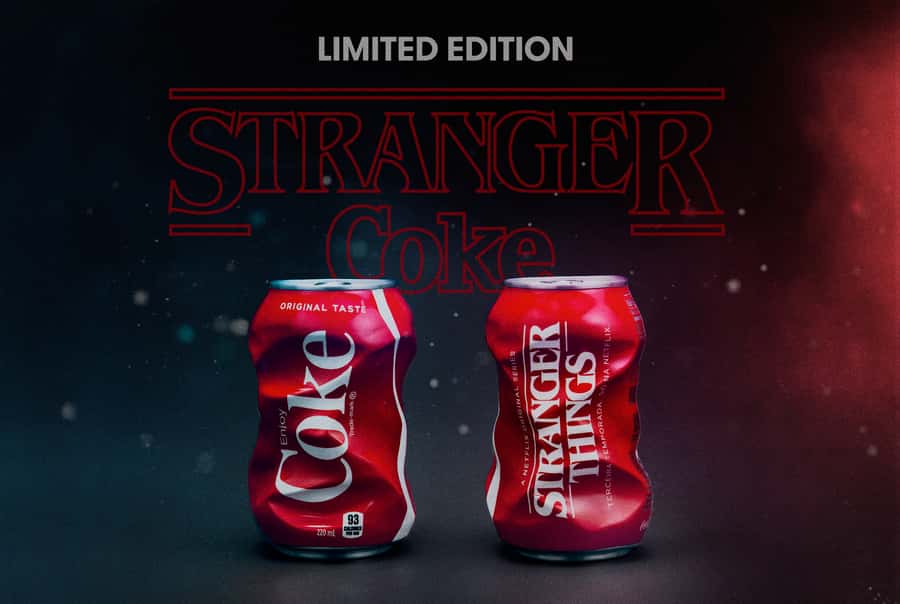
Brand collaborations with Coca‑Cola, Nike, LEGO, apparel lines, even stage productions and immersive experiences.
Product cameos that turned into cultural moments — from Eleven’s Eggo waffles to Dungeons & Dragons starter sets.
Music revivals, like Kate Bush’s "Running Up That Hill" surging back into charts because of one perfectly placed Season 4 sequence.
None of that works unless the core brand is:
Emotionally clear – friends, fear, found family, growing up.
Aesthetically consistent – you can drop the logo on a sneaker or a notebook and it still feels right.
Flexible – it can stretch from horror to comedy to heartfelt drama without breaking.
That’s the kind of brand StoryPress was built to serve: not just a logo and a blog, but a living system that can flex across posts, collections, and experiences.
How StoryPress Lets This Post Go Full Hawkins (Without Breaking the Site)
Under the hood, StoryPress’s theme system lets us do something very Stranger Things:
We have a “normal world” theme — your usual brand colors, fonts, and layout rules applied globally.
For this post, we apply a page‑level theme override:
Background shifts to near‑black.
Text flips to warm off‑white.
Headings move to a cinematic serif and burn in red.
Small UI bits (labels, meta, pagination) can lean into a subtle 8‑bit vibe.
A collection view (for a series of pop‑culture x branding essays) could share this look, while other categories stay on your main brand.
You’re effectively doing what Stranger Things does with Hawkins vs the Upside Down: same world, different rules.
The point isn’t to show off configuration knobs. It’s to let the story you’re telling dictate the experience the reader has, without forcing you into a separate site or a hard‑coded one‑off layout.
Closing the Gate
Season 5 is the last ride for the kids from Hawkins — one more night of flashlights in the woods, weird power surges, and synth lines humming over red titles.
For us, it’s also a reminder of what great branding really does:
It sets a tone before a single word is read.
It holds together across every channel and collaboration.
It gives fans a world they want to step into again and again.
With StoryPress, we wanted to give creators that same kind of power — the ability to shape how a story feels at the page, post, or collection level, not just drop text into a rigid template.
Tonight, this post is our little portal into Hawkins.
Tomorrow, it could be your world instead.
Get the Strangest, Straight to Your Inbox
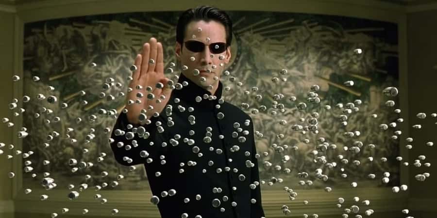
The Matrix Had Bullet Time. Your Website Has 1 Second
When The Matrix premiered in 1999, it didn’t just add another sci-fi entry to the shelf. It changed how movies looked, how action moved, and how audiences understood visual storytelling. And unlike many cultural moments, this one stuck.
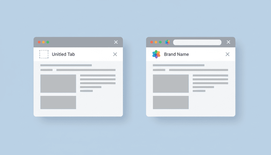
The Favicon Fix — The 5‑Minute Branding Upgrade Most Sites Mis
Your favicon—the tiny icon in a browser tab—is one of the quickest ways to look credible and consistent online. StoryPress ships without a default icon so your brand is the focus from the start. This guide covers why favicons matter, how to create one that stands out, and how to confirm your site displays correctly across devices.