The Matrix Had Bullet Time. Your Website Has 1 Second
When The Matrix premiered in 1999, it didn’t just add another sci-fi entry to the shelf. It changed how movies looked, how action moved, and how audiences understood visual storytelling. And unlike many cultural moments, this one stuck.
What The Matrix Really Changed.
Even today, 25 years later, viewers instantly recognize its cues: the green digital rain, the dual-world color palette, the slow-motion clarity of bullet time. These weren’t stylistic flourishes — they became part of our shared visual vocabulary.
For brands, that shift matters more than most people realize.
1. The Visual Baseline
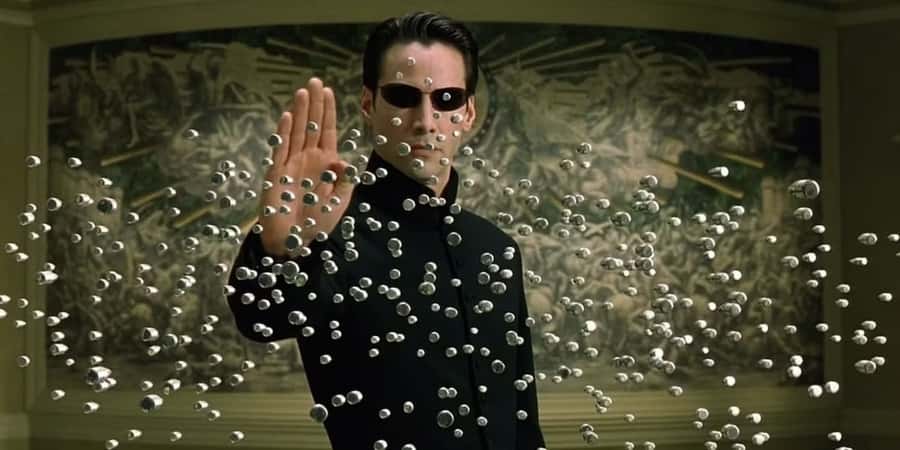
Bullet Time
The film’s signature effect — 'bullet time' — became one of the most imitated visual ideas in modern cinema. Why it matters: It made complexity legible. It let audiences see chaos with perfect clarity — a concept that now feels standard, even expected. Today’s viewer assumes visual media should 'just make sense,' fast.
Historical Counterpart: Vertigo
Decades before bullet time, Alfred Hitchcock introduced the 'dolly zoom' in Vertigo. By moving the camera forward while zooming out, he created a disorienting shift that visually conveyed psychological collapse. Like bullet time, this single innovation permanently altered visual literacy.

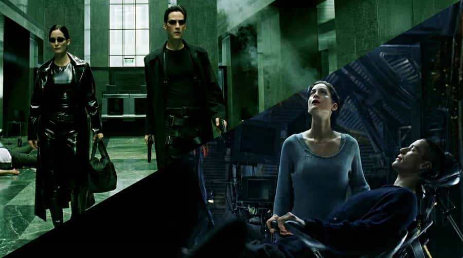
2. Coherent Dual-World Look
The Wachowskis used two distinct palettes: Green tint for the Matrix, Blue tint for the 'real world.' This helped mainstream audiences feel color as context.
“A generic layout feels like a simulation of a real brand.”
The Branding Anomaly
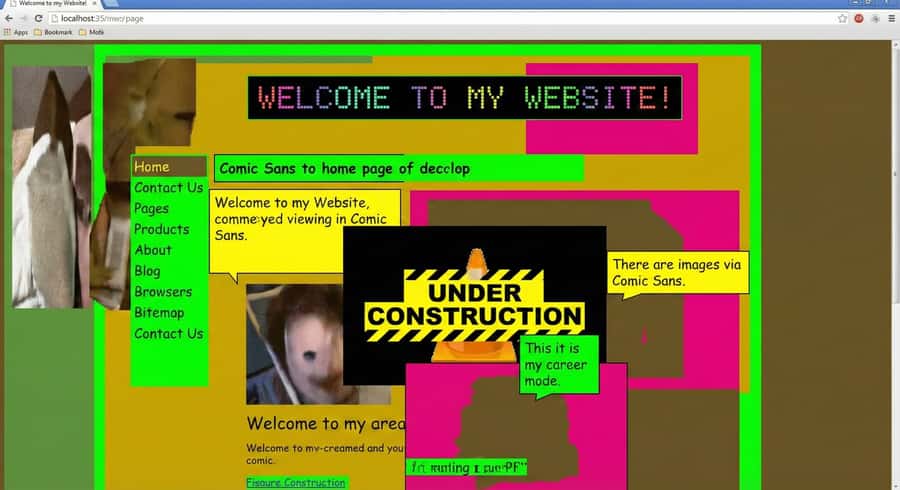
So what does this have to do with branding? A lot. After The Matrix, audiences unconsciously expect clarity, intention, and cohesiveness. Their bar for 'professional' is shaped by everything they watch and use.
A confusing website feels like glitching code. A mismatched color palette feels 'off'. A generic layout feels like a simulation.
Most Small Brands Struggle Here
Not because they’re sloppy, but because the digital 'baseline' has risen far faster than budgets. Modern audiences compare every site to apps with billion-dollar design teams. It’s an unfair fight. That is, unless the platform handles the heavy lifting.
The Construct:
StoryPress
StoryPress was built on a simple idea: Every business deserves a site that meets modern visual expectations — without requiring modern budgets. We do that by providing modular components that stay coherent by default.
One Visual System. Infinite Realities.
The Matrix rewired cinema’s aesthetics — StoryPress lets you do the same to your site.
Every page, post, and collection can break the mold: swap layouts, mix components, shift tone. Unified design language, fully bendable rules. Choose your reality.
The Essentials, Pre-Loaded
Think of it as your “I know SEO” moment.
Analytics, SEO, lead capture — already plugged in. No plugins, no kung-fu downloads. Just open the laptop, and you’re already ahead of the agents.
Closing Thought
The Matrix changed visual culture by making complexity feel understandable. People expect that everywhere now. Brands that deliver clarity win attention. Brands that look accidental lose it. StoryPress gives small businesses the clarity advantage — without needing to be Neo.

Your Website Just Got an AI Co-Pilot: The StoryPress MCP Server
What if your website could talk to an AI that actually understands it — not just the code, but the content, the structure, the design system? That’s what the StoryPress MCP server makes real. It’s the bridge between conversational AI and your live site, and it changes everything about how you build, edit, and maintain your web presence.
Entering the Upside Down: What “Stranger Things” Teaches Us About Branding
How one show turned nostalgia, typography, and world‑building into a masterclass in brand — and how StoryPress lets us bring that energy into a single post. Tonight, as Stranger Things returns for its fifth and final season, it’s not just Netflix lighting up.