Contact Forms That Get Replies

A visitor who opens your contact page has already decided you might be worth hiring. This is the warmest traffic your site gets, warmer than any ad click, and it is exactly where most small business sites spring a leak. An accountant asks for a phone number and loses the after-hours browser. A contractor demands a project budget before a first conversation. A studio hides the form under a wall of office details nobody came for. Each choice feels harmless and each one turns real prospects away silently. This guide walks through the five decisions that separate forms people submit from forms people abandon.
Most contact forms collect dust. The business owner adds a form, waits for leads, and nothing happens. The temptation is to blame the traffic, but the form itself is usually the leak. The number of fields, where the form sits, what the button says, and whether the visitor trusts the page all decide whether someone actually hits send.
The good news: contact forms are one of the highest-leverage fixes on a small business site. Cutting a form from eleven fields to four can lift conversions dramatically, and it takes ten minutes.
The one rule: every field costs you leads
Each field you add gives the visitor another reason to leave. Research across thousands of forms points the same direction: shorter converts better. HubSpot's form research found conversion drops sharply after three fields, and fields like phone number can cut completions by up to 5% on their own because people do not want a sales call.
Ask yourself for every field: do I need this to REPLY, or do I just want it? You need a name, a way to respond, and what they want. That's three fields.
The difference three fields make
Here is the same business asking for a quote request two ways. Which one would you fill out at 9pm on your phone?
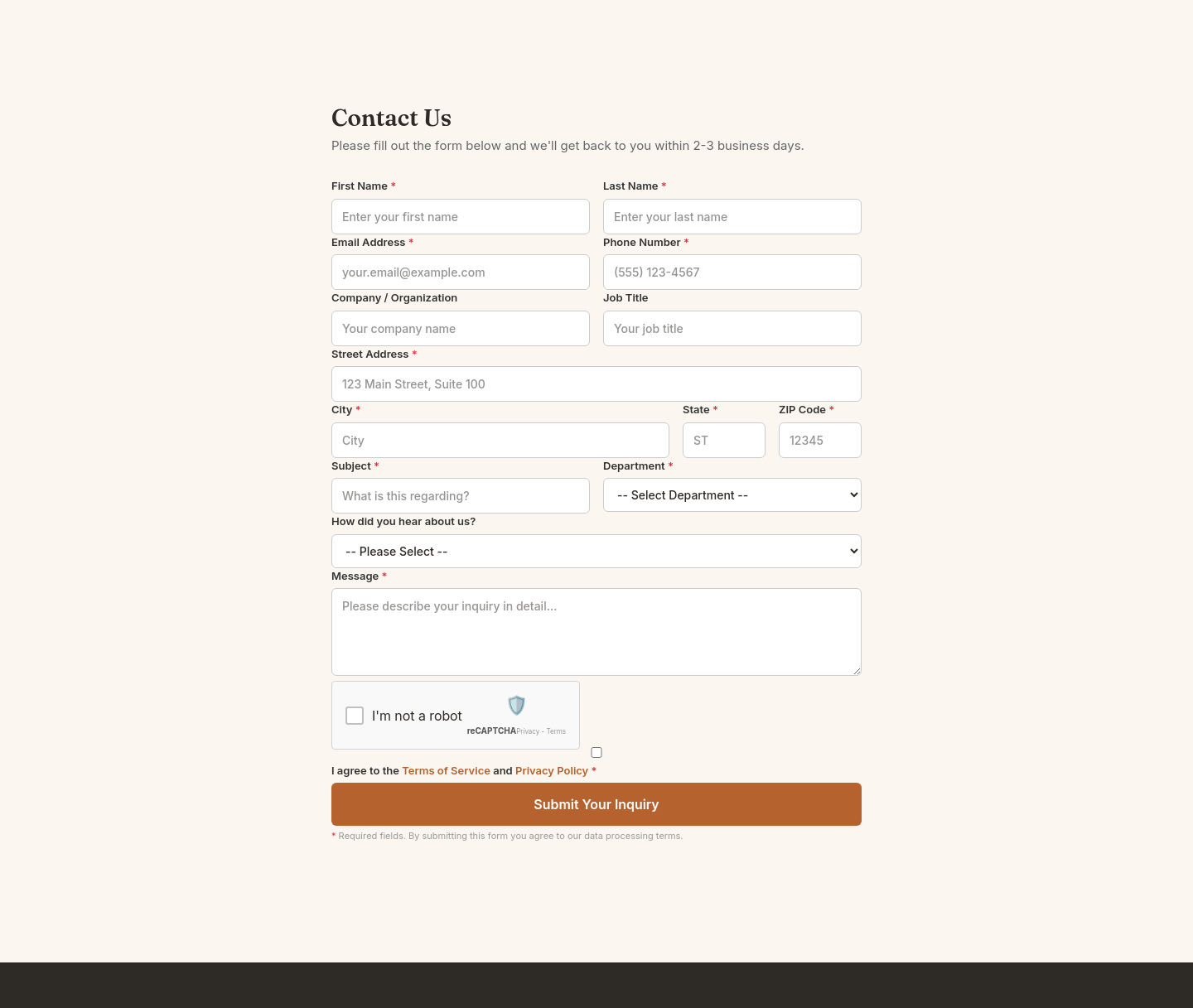
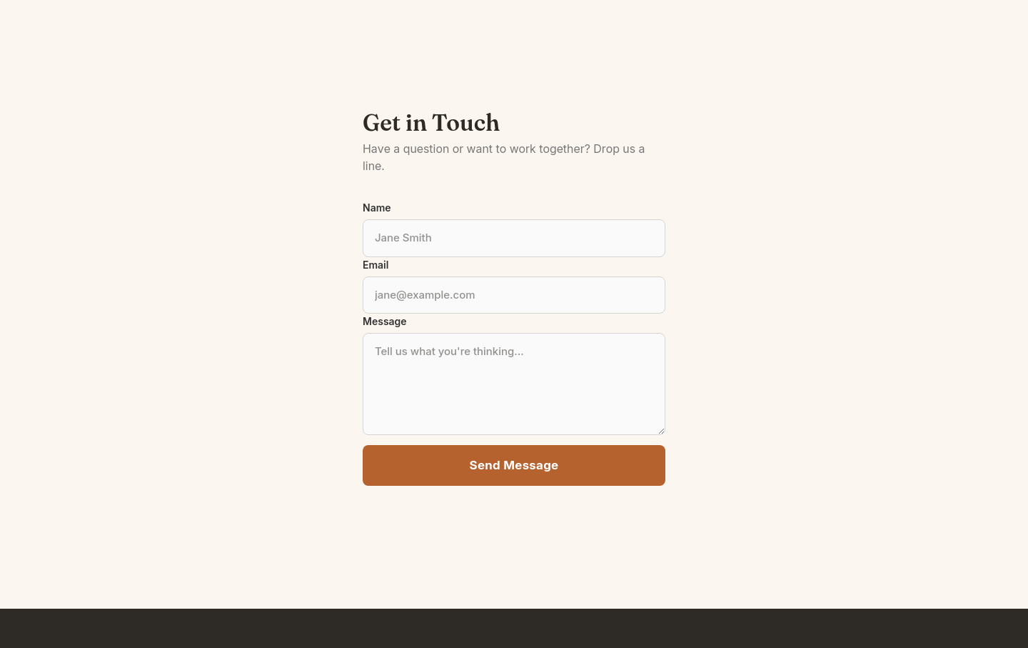
The first form asks for a job title and how they heard about you before they can ask a question. The second gets out of the way. Every additional field says: our convenience matters more than yours.
Five fixes, in order of impact
Cut to 3-4 fields. Name, email, message. Add phone ONLY if you truly need calls, and mark it optional.
Rewrite the button. "Submit" is what databases do. Try "Get my free quote" or "Send message" — say what happens next.
Put the form above the fold on your contact page. Not below a map, not after three paragraphs about your history.
Say what happens after. One line under the button: "We reply within one business day." Sets expectations, builds trust.
Kill the CAPTCHA if you can. Modern spam filtering (honeypots, Turnstile) works without making humans prove they are human.
Where forms go to die: placement mistakes
Only on a /contact page nobody visits (add a short form to service pages too)
Below the fold behind a wall of text
In a footer at 10px font size
Behind a 'Contact' link in a hamburger menu on mobile
The pattern behind all four: treating the form as an afterthought instead of the point. If enquiries are how you make money, the form is the most important element on the page.
Trust signals that raise completion
A visitor filling out your form is taking a small risk: their inbox, their time, maybe a sales call they do not want. Three cheap ways to lower that fear:
A real reply-time promise (and keep it)
A privacy line: 'We never share your details.' One sentence, not a legal page
A photo or name of the actual person who replies
Do I need this field to reply, or do I just want it? You need a name, a way to respond, and what they want. That is three fields.
Test it this week
Note this week's enquiry count. Cut your form to three fields, rewrite the button, add the reply-time line. Change nothing else. Compare the next two weeks against your baseline. Small sites will not hit statistical significance, and that is fine: you are watching direction, not decimals.
One practical note: this experiment only happens if editing your site is trivial. On a StoryPress site you can tell Claude "cut the contact form to three fields and change the button to 'Get my free quote'" and it is done. Whatever platform you use, remove the friction between you and the test, because the form you never fix converts nobody.
Get practical website guides like this one, every week.
'Crawled - Currently Not Indexed': What It Really Means
Of all the statuses in Search Console, this one stings the most because nothing is technically wrong. Google found the page, fetched it, parsed it, and then declined to keep it. No error to fix, no red icon, just a quiet judgment that the page was not worth storing. Site owners burn weekends resubmitting sitemaps and tweaking settings, because it feels like a bug. It almost never is. This guide explains what the status actually means, which pages belong in that bucket on purpose, the one technical check worth running, and the content upgrade that actually moves a page out of it.

The Real Cost of a 'Free' Website Builder
Every website builder has a $0 tier, and the price is doing more marketing than the product. What the landing page does not show: your business living on a subdomain you do not own, the platform's ads on your pages, your site invisible in search because indexing is throttled or the pages are too slow, and the export button that does not exist when you try to leave. Free tiers are engineered to be outgrown painfully. This guide itemizes what each popular free plan actually withholds, what the real monthly number becomes once you need the basics, and when free genuinely is enough.